
So you’ve started looking into creating a new site. Or it’s time to redo an existing site. As you look to the Internet for inspiration and ideas, you see the word ‘responsive’ and perhaps a ‘mobile-friendly’ here or there. What’s the difference between mobile-friendly and responsive websites?
First, let’s acknowledge a current baseline. 52.2% [See Chart Below] of Internet users are using the Internet with mobile devices. The trend is upward and doesn’t look like it is slowing down at all. In fact, a recent study1 shows 98% of Generation Z (ages 0-21) owns a smartphone and 52% of Gen Z report that their smart phone is their most important Internet device. Next, we know people want things faster and bigger and more convenient. Mobile phones and tablets satisfy those qualifications and act as portable computers that fit in our hands. With this data and endless studies showing users of all ages using a variety of devices, as savvy website developers, it would behoove us to make the user experience as pleasant as possible on their device of preference.
Mobile-friendly
When the mobile phone craze grew beyond flip-phones and WAP (Wireless Application Protocol), the clunky old way of viewing Internet on a phone, it became apparent that this market must be addressed. Making sure the website loaded was the first and easiest solution. The next option became to create a mobile version of a site, commonly referred to as an ‘m’ site. They were called this because the URLs were usually created as m.whateverdomain.com. These two methods are referred to as mobile-friendly, as they attempt to take a site created for a desktop/laptop computer and make something digestible by a mobile phone. The challenge with a mobile-friendly site is it typically not user friendly… some content can be missing or there is a lot of pinch-and-zoom in order to see all of the content.
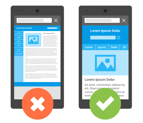
Responsive layout (right) is much easier to consume with a mobile phone.
Responsive
We then evolved to responsive layouts. This method of coding pages delivers pages based on a device’s screen size and does not need to check for specific devices because it is ready for all of them. It ‘responds’ by providing the optimum layout for a device’s (or browser’s) available width. Achieving this flexibility, however, is not automatic. There are things a developer must do to ensure a responsive website. Free frameworks are available, which take the headache out of building the skeleton of a responsive website. Twitter Bootstrap and Zurb Foundation are two widely popular frameworks that are very easy to implement. However, even with these frameworks in place, content layout must still be built properly. One wrong piece of code and the whole thing can break and ruin the user experience.
At this point, very few sites are utilizing the m.website method and most are becoming responsive. In 2015, Google has started weeding out those sites NOT deemed mobile-friendly (responsive) because they don’t give the best experience for the user. So, to increase search-ability and improve user experience, consider taking steps towards a responsive site.

To improve user experience, websites should be responsive.
If you need help, or would like an SEO analysis on your website, please contact Cranson Solutions… we are happy to help!
Source: 1 GlobalWebIndex